
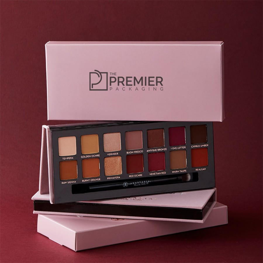

Every beauty brand owner knows the feeling. You spent months tweaking formulas, picking pigment loads, and testing pan presses. But once your product hits retail racks, none of that work shows through cardboard. Your packaging carries the entire workload of grabbing a busy customer’s eye before they move down the aisle.
Beauty retail aisles are noisy. Dozens of brands stack their palettes together under bright shop lights, leaving you with roughly two seconds to make an impression.
If you want your boxes to get picked up and actually carried to the checkout register—you need a smart mix of visual punch, sturdy material choices, and clean layouts. Here is how to pull it off.
1. Stop Trying to Please Every Type of Shopper
One common mistake cosmetic startups make is trying to design a box that appeals to everybody. That usually results in a watered-down style that nobody notices.
Instead, double down on your specific niche:
- The Everyday Minimalist: Stick with muted earth tones, soft-touch matte papers, and plenty of empty space. Clean beauty buyers tend to distrust chaotic or overly shiny graphics.
- The High-Pigment Artistry Fan: Go dark. Rich black background materials paired with vivid artwork tell makeup junkies that the shadows inside pack serious color payoff.
- The Eco-Conscious Buyer: Raw brown kraft paper, soy-ink accents, and visible fiber textures immediately show people that your brand takes sustainability seriously.
When your packaging speaks directly to one group’s aesthetic taste, it cuts right through shelf clutter.
2. Master Lighting and Color Contrast
Store lighting is notoriously tough. Fluorescent bulbs and angled spot lamps can turn subtle pastel designs into flat, washed-out shapes.
To beat bad retail lights, focus on contrast rather than just bright colors:
- High-Contrast Text: Make sure brand titles and key details stand out clearly against background colors. Dark gray copy over cream paperboard or metallic foil on deep matte finishes work exceptionally well.
- Color Hints on the Outside: Give shoppers a quick preview of the shades inside. A simple side strip along the box edge or color-matched embossing tells buyers what to expect before they ever pull off the lid.
- Avoid Low-Contrast Trends: Low-contrast pairings—like light beige text printed on pale yellow cardstock—might look pretty on a designer’s computer screen, but they vanish under retail lighting.
3. Don’t Skimp on Structural Board Quality
Eye shadows shatter easily. A dropped box in transit or a clumsy moment on the store floor can ruin an entire batch of pressed powders. Beyond protecting the formula, thick paperboard adds a tactile weight that customers naturally link to high quality.
| Packaging Type | Typical Material | Ideal Use Case |
| Rigid Boxes | Thick paperboard core | Multi-shade palettes, premium collections |
| Tuck-End Cartons | 16pt–24pt folding cardstock | Single eye shadows, budget lines |
| Eco-Kraft | Uncoated recycled stock | Natural, organic cosmetic lines |
Choosing sturdy custom eye shadow boxes with snug internal foam or paper trays keeps fragile pans locked safely in place during shipping while keeping the exterior looking clean and sharp.
4. Use Print Finishes to Drive Physical Interaction
Visuals get people to look, but texture gets them to touch. The moment a customer picks up your box from a rack, your odds of making a sale jump significantly.
Try using one or two of these tactile techniques:
- Spot Gloss: Adding a shiny UV coat to just your logo or key graphics creates a neat contrast against a flat matte background.
- Metallic Foil: Silver, gold, or rose-gold foil stamping adds instant pop under store lights without overwhelming your artwork.
- Soft-Touch Coating: This finish gives cardboard a smooth, velvet-like texture that feels satisfying to hold.
- Embossed Textures: Raising letters or icons slightly off the card surface gives your product a 3D touch point.
Pro tip: Pick one primary finish and one subtle accent. Mixing three or four different special effects on a small box usually looks busy rather than luxurious.
5. Get the Functional Details Right
A box can look gorgeous, but if the latch breaks or the lid is painful to pry open, buyers will get frustrated fast.
- Magnetic Snaps: A soft magnetic click gives off an upscale feel and keeps palettes closed tight inside purses or travel bags.
- Usable Mirrors: If your palette includes a mirror, make sure it is clear glass, free of distortion, and large enough to be genuinely useful.
- Smooth Openings: Outer tuck boxes should slide open easily without tearing the paper flaps or digging into fingernails.
6. Strip Away Front-Panel Clutter
When graphics get overcrowded, buyers stop reading. Your front cover needs to get straight to the point.
- Keep the Front Clean: Stick to your brand name, the main palette title, and one clear selling point (like All-Day Wear or 100% Vegan).
- Move Details to the Back: Place ingredient lists, net weight specs, distributor information, and barcodes on the bottom or back panel where they belong.
- Establish Order: Use different text sizes so the eye naturally lands on your brand name first, followed by the product line.
Wrapping Up
Designing eye shadow packaging that sells is all about balance. Start with a solid structural build that protects your product, add contrast that catches the eye under harsh lights, and finish with clean typography that keeps things clear. When you focus on quality materials and intentional design details, your boxes will have no trouble grabbing attention on crowded store racks.